
CEBL 2022 Sartorial Rankings - Picking a Favourite, Based on Jerseys & Logos
July 10, 2022
Welcome to the 2022 CEBL Sartorial Rankings, or: Which Canadian basketball team should you cheer for, heading into the CEBL Championship Series, based off of "the cover and not the book"?
Cheering on a sports team to win a Championship, or heck a game, can be a lot of fun. It feels great to have a favourite team, and to be invested in success outside of yourself.
With the
NBA Championships having just come to an end, you’re likely also missing
basketball already.
With the
Stanley Cup having just come to an end, you’re a Canadian who needs team sports
on your TV.
Luckily the
latest CEBL season is in full swing. The Canadian Elite Basketball League is still sparkling new, and has a ton of potential. About three quarters through its 20-game fourth season (with
the second season having been a pandemic-shortened Summer Series) Canada’s
FIBA-affiliated pro basketball league continues to grow, with ten teams
coast-to-coast and more on the way. Mike Morreale, league CEO, has been quoted as
saying the CEBL was a “party wrapped around a basketball game” and production
choices have proven just that, with a strong podcast and YouTube presence,
energetic social media presentation and streaming service called CEBL+, not to mention games viewable through CBC, that
allow for Canadians to watch every one of the league’s games. Even the final four
Championship Weekend, which is one part-NCAA Final Four (naturally) and one-part
CHL Memorial Cup (with the Weekend's hosts getting an automatic invitation), is the
perfect encapsulation of the idea of a party wrapped around a basketball game
with a festival atmosphere ending in a CEBL Champion being crowned.
Even when
there is room for improvement, like with the camera angles during broadcast
games, or the Championship trophy looking to be made of hard plastic instead of
shimmering gold, it feels like a matter of financial opportunities which will only
improve with the success of the league. Importantly the infrastructure is
there, the bones are strong, and the ground-work has been established and details have been thought out.
Being a new league however, you might not be familiar with the four-year old CEBL like you are the sixty-four-year-old CFL in terms of Canadian pro league knowledge, and because of this you likely don’t have any loyalties to a team. Even if you have a team in your hometown there is a chance you haven’t gone to a game, due to the pandemic having existed across 75% of the CEBL’s tenure thus far.
Also the NBA is known as a player’s league these days but that almost works against the CEBL when it comes to picking a favourite team because of the size of the CEBL and its place in the larger pro basketball eco-system. Shaq Keith for example went from a good player on a great team to an important piece of a Championship team after a mid-season trade in season one, and has since played on a different team every season since (while also playing in the Finnish and Hungarian pro leagues). Xavier Moon might just have the CEBL MVP award named after him, after winning it in each of the CEBL’s first three seasons on top of also winning the Finals MVP the last two season, but will not be playing in the CEBL this season after being snapped up by the Los Angeles Clippers in late 2021.
So if you
don’t have any immediate connection to the people or the place that the CEBL
call their own, let me recommend an idea that my mother always went with when
picking sports teams: the sartorial.
As the famous stand-up comedy bit by Jerry Seinfeld goes, “It’s different guys every
year. You’re rooting for clothes, when you get right down to it. We’re
screaming about laundry.”
Jersey
designs will be important for this thought exercise, but let’s not just stop
there. What is their logo, their colours, and the team’s name? Heck, what does
their mascot look like, and do they have any other x-factors that might help
their case as the “party” that you want to be a part of?
Though the
league starting just as the Toronto Raptors were making their run for the NBA
Championship, bringing the Larry O.B. north of the border for the first time,
certainly wasn’t intentional. What seems intentional is most every team in the
league following the sartorial example set by the Raptors. Don’t be afraid to
be cartoony and colourful. Being cool shouldn’t be a concern. Cool is niche.
You want kids to be fans, because as long as you’re successful or at the very
least looking to improve, you’ve got fans for generations that will hold onto
that identity with love. Shout out to the Raptors’ Purple Barney jerseys. Let
the brand breath over a couple of decades and you’ll have time to be cool.
Breaking it
down, I use an “obsessive eye for athletic aesthetics” taught to me by Paul Luckas of Uni Watch, and mix in the kind of sabermetrics that are only possible
because I’ve read way too many articles published by Grantland and The Ringer. (Basketball fan and comic book journalist David Harper at SKTCHD has also used this kind of method to great effect when not simply writing wonderful features on comics, check him out as well!)
- As many as 10 points will be given for a Team Name.
- As many as 10 points will be given for a team’s official colours.
- As many as 10 points will be given for a team’s logo.
- As many as 10 points will be given for a team’s jersey design.
- Finally, as many as 10 points will be given for the X-factors (a third jersey, mascots, social media presentation, community initiatives, etc).
In total
each team has a chance to score 50 points in this CEBL 2022 Sartorial Ranking.
With all that in mind, let me help you find a new favourite team on the Road to the 2022 CEBL Championship Weekend in Ottawa.
TENTH
PLACE
Scarborough Shooting Stars
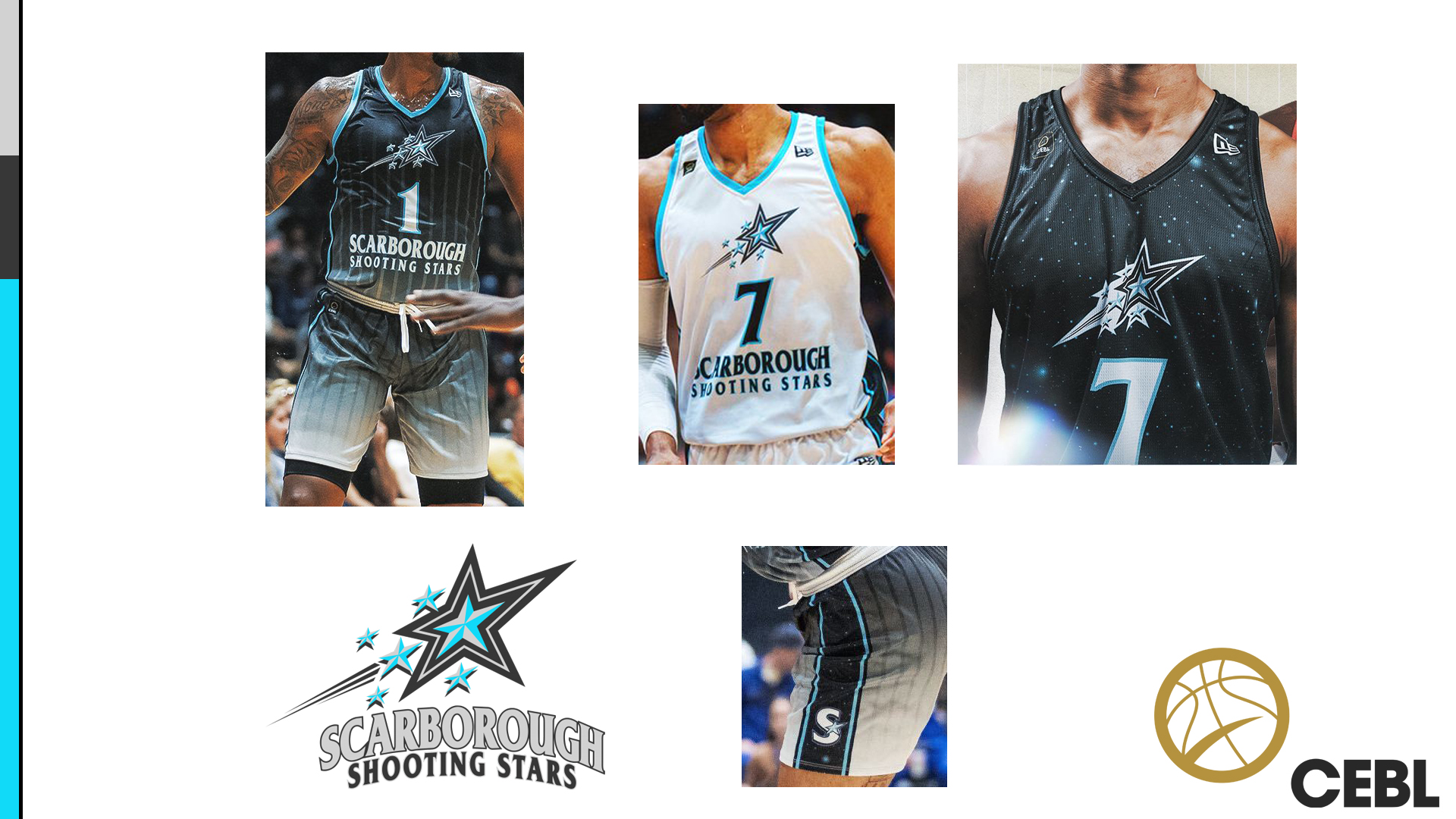
Team Name
(1/10) – “Shooting Stars” is a name that does not work for me for a number of
reasons. Firstly using an adjective in your name feels minor-league from the offset. Couple that
with placing “Shooting” next to Scarborough and you are immediately associating
the negative image of crime and gun death with this diverse and interesting
community. It’s unnecessary. To then use it to shoehorn in such a basic concept
as a “Star”, when the region doesn’t even have an association with it any way (the Observatory is to the north of Toronto, not to the east) feels like a huge miss.
Logo (2/10)
– The misses continue. The Shooting Stars are the first team to buck the
animal-based naming and/or design convention of the CEBL. This could work, with
that right idea. This logo is not the right idea. It’s a double-outlined
nautical star with an asymmetrical skewed designed, flanked on the right by
five smaller nautical stars and speed-lines to imply that “shooting” speed. This continues the unfortunate theme of "too much". It’s unnecessarily busy without allowing for an ownable identity. Why are all
the smaller stars nautical stars as well? Everything about this logo makes the
team look like the minor-league affiliate for the NBA’s Orlando Magic. The high
contrast serif font used for the team name on the logo, which looks to be in the Harmonique font family, at least helps keep the
twenty-four letters of the team name legible.
Colours
(6/10) – Turquoise, black, grey, and white. Turquoise as a main colour is good
choice, allowing for a bright counter to the grey-scale of the rest of the
palette. With these colours however the unintentional(?) connection to the
Orlando Magic continue.
Jerseys (4/10)
– With their jerseys, Scarborough Shooting Stars immediately jumped out of gate
with three distinct identities without unveiling any of them to the public
before-hand. Each have interesting ideas, and each are too much. Their dark jersey is black to white vertical gradiant that
resets at the waist and begins again on the shorts, that ALSO features white
pinstrips that fade in on the top and black pinstripes that fade out on the
shorts. But that’s not all! The jersey features the team logo across the
chest with a large jersey number under that, and under THAT (closest to where a
player would tuck their jersey into their shorts) are the twenty-four letters of
the team name (for optimal chaos). The side-panel on the jersey’s top and
shorts (side panels are a feature on almost every CEBL jersey) is black with speckled
white/blue stars with turquoise piping on either side of the black star-field
and the secondary S-logo on the bottom of the shorts. All of this is on one
jersey. I haven’t even begun to describe the light jersey. Luckily the
light jersey is easier to explain, as it is white fading very subtly to turquoise,
which once again resets for the shorts. The light jersey also unfortunately stacks
the logo, jersey number and team name in that order, making the team’s name
look like a Euro League jersey sponsor. Finally, Scarborough jumped out of the
gate with an alternate jersey (because of course they did), which also happens
to be the most successful of the three because it doesn’t try to crash the
entire team name along the stomach of the jersey. The alternate jersey is
simply the black sparkling starry field of the side panel across the entire
jersey with no side panels, and with a slightly larger team logo across the
chest with the jersey number below that. Of course, the logo is made even more
visually muddled by having a white outline around everything.
X-Factor (4/10)
– The Scarborough Shooting Stars have had a role out that I’ve
already called out once in this write-up. For all the bells and whistles of the
three jerseys, they had zero previews across socials, no unveiling, minimal
hype. I hadn’t even noticed anything involving their blue Martian-like
mascot until I saw it on the CEBL twitter account, even though I had done research prior to the league tweet for this thought exercise. As the team co-owner comes
from OVO, the Drake-associated clothing brand, one would hope that hype would
be the team’s specialty. Instead it has been a slow start for this debuting
team, when it comes to introducing what is appealing about this team. Of the
three debuting teams in 2022 they are also the only one without the ability to
purchase Merch on-line. The visual language that has been shared online does
show promise,
leaning on greyscale which sometimes incorporates the turquoise.
SARTORIAL
SCORE – 17/50
How would I
improve the Scarborough Shooting Stars sartorial score? Well if we want to lean
into being a part of the OVO family, and don’t think Owls are tough enough
(they are) then let’s look at Drake’s many albums and, aha: Scorpions. What’s
better then shooting? Scoring. The Scarborough Scorpions would then be part of
the animal kingdom of CEBL logos, and they could lean into the hard-earned
toughness of Scarlem. You’re telling me an S in the shape of a Scorpion’s tail
wouldn’t be a good secondary logo? Give me Scar the Scorpion with a bad-ass scar over their
left-eye for a mascot! Keep the turquoise, silver, and black. Heck, even the sparkling
star field alternate jersey that Drake wore to rep the team court-side during
the home opener for the Shooting Stars could stick around as the “Scorpio” star
sign alternate jersey. In the end all these notes come with love. As a Toronto east-ender
I want Scarborough to succeed in the CEBL.
NINTH
PLACE
Niagara
River Lions
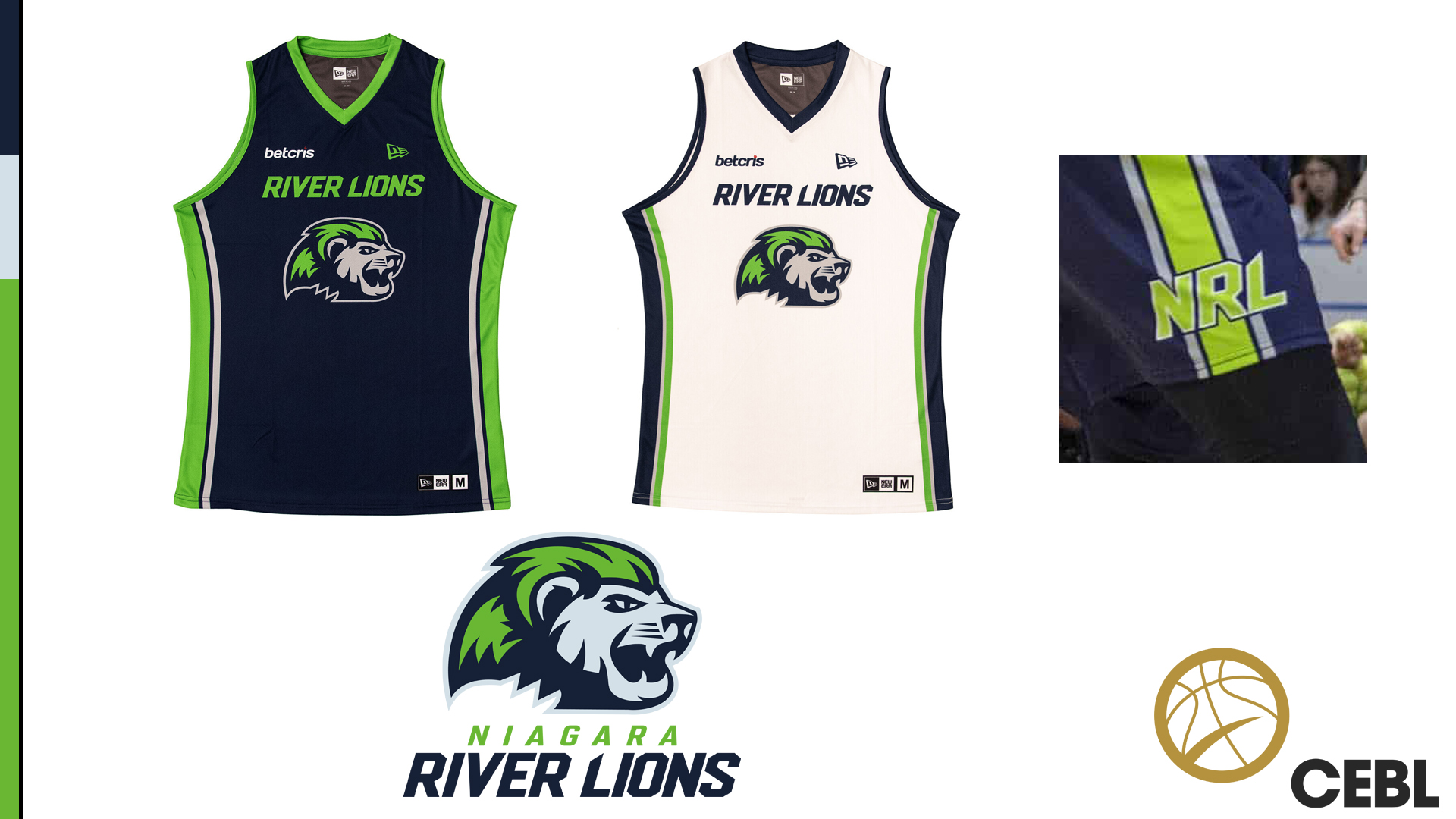
Team Name (7/10)
– The name Niagara River Lions is a wild team name based solely on the choice
of putting the line-break before river and not after it. The team is based in
the Niagara Region largest city of St. Catharines, and the city is on the
Niagara River which ends at the world-famous Niagara Falls. I say all of this to
help explain the choice made to make the team logo not just a lion, but a River
Lion! You created your own mythical beast! Wild.
Logo (6/10)
– What is a River Lion? It’s a lion BUT that has grey fur and a neon green
mulleted mane! No notes! Actually, I will add that the lion looking to the
right, with a slight tilt of the head to the center gives the logo great action
and dimension. Doing all the shading in the grey and navy blue of the team
colours is also excellent. The team name’s font is a strong, sharp Pittsbrooks
sans serif italic.
Colors
(6/10) – Neon green, navy blue, and grey match the bright green and dark blue of St. Catherine’s city logo, while
also giving the team the kind of bright green that few other basketball
franchises outside of Minnesota have ever tried to use, let alone with a River
Lion (though admittedly the NFL’s Seattle Seahawks have used it best). Points
for the bold color, extra point for municipal pride.
Jerseys
(2/10) – It was all going so well! Dear reader, you must have been wondering
how the majestic mulleted lion of the river ended up so near the bottom of
these Sartorial Rankings? Well, I’ve got bad news. In an almost impossible turn
of events the team has got really boring kits. As the only franchise in the
CEBL older then the league itself (fun fact, the owner of the Niagara River
Lions helped found the CEBL after joining the National Basketball League of
Canada in 2015 and being supremely unimpressed by the scale of operations), the
River Lions have decided to play it SO VERY down the middle. They haven’t even won a
Championship, and they’re already the New York Yankees of this league without
the pinstripes! The colour jersey is navy blue with neon green side panels
(side note, this also makes the Niagara River Lions the only team without a
signature side-panel pattern for additional lost points), “River Lion” at the
top in neon green and the logo on the chest. On the shorts on the bottom of the
side panel is “NRL” in neon green. The light jersey is white with navy blue
touches. They do have a third alternate jersey, which like the rest of a league
follows a template of color block on top (in this case navy blue) and neon
green numbers and highlights around the neck, and images are hard to find but
it does have Niagara on it as well. Again, nothing much to report.
X-Factor (5/10)
– Everything from the social media presence to the mascot (muscle lion, nay,
River Lion named Dunkin because why not) says that this franchise is a
professionally run franchise while not showing a ton of personality past
“professionally run franchise”. Wait, with a mascot named Dunkin and an inability to win the Championship... Niagara aren't the Yankees, they're the Red Soxs!
SARTORIAL
SCORE – 26/50
How would I
improve the Niagara River Lions sartorial score? Lean into that neon green.
This franchise is good, it doesn’t have to be boring. The light jerseys don’t
have to be white; they can be neon green. The solid band of color on side
panel? I’ve noticed use of a painted-style font on branding along with the
blocky Pittsbrook font, paint a line down the side of the jersey to give it
some texture. Embrace that neon-green mullet of the Niagara River Lion! Have
fun! Oh, and speaking of which, I need to be able to purchase a green mullet at
a merch stand. Please and thank you.
EIGHTH
PLACE
Montreal
Alliance

Team Name
(7/10) – Montreal Alliance seems like a pretty non-descript name at first, but
I enjoy all the reasons why and how it is used. Alliance is of course a strong
unifying team name, it allows for some close association with the Allouetes of the
CFL, and it is a word that is spelled the same in both French and English.
Great for a bilingual city. From the logo choice, there is also the broader
wolf pack connection in “alliance”. Also, always love seeming a team name that
doesn’t end with an “S”, as it is an exclusive club in North American sports.
Logo (6/10)
– The logo is a slightly asymmetrical wolf’s head, which has a fluer-de-lies on
the forehead. The asymmetrical touch comes with the fur on the neck, which
looks as much like a whispy ghost tail as it does a curl of fur. The flatness
of the nose also feels more like a bug then a feature, however I appreciate the
front-facing aspect of the logo as it allows visual diversity within the
league. The logo font is from the Jawbreak family of fonts is a stylish font
which has no distinctive connection to the franchise or feel of the team, aside
from being a good branding font.
Colours
(7/10) – Light blue, dark blue, red, and white. It’s Montreal, anything too far
off of red, white, blue would feel overly complicated. Deciding to add a light
blue to the red, white, and blue ascetic also gives the franchise its own
colour within the community, as I would associate red with the Montreal
Canadians, and dark blue with the Montreal Allouttes.
Jersey
(5/10) – Points for giving the team two coloured jerseys, for the dark and
light options. Deciding to go with two shades of blue however feels like a
missed opportunity to me. It creates a narrow visual identity in my mind. Also
not helping with the visual identity is the lack of a secondary logo on the
shorts, where most all of the other teams in the CEBL use the opportunity to
expand their branding. On the side of the shorts they feature the wolves-head
logo which is too complex to use at a smaller side especially with the business
of the side-panel. The side-panel, speaking of which is a new one in the
league, as they’ve gone with a dark blue and white checkered pattern. Though
the checkered pattern is distinctive I don’t understand the connection to the
logo or name. On a positive, I enjoy how the different colors on the collar of
the jersey and collar of the sleeves compliment the waist-band of the shorts.
X-Factor
(7/10) – I want to like this identity, the name is interesting, the logo works,
and the colours are exactly what they should be. However not everything fully
works together. Everything from their social media presentation to their mascot
shows that this is a clearly designed and well-developed presentation and
likely just needs a bit of time to refine itself. Oh, bonus points for the name
of the mascot being Alli-Oop. Brilliant.
SARTORIAL
SCORE – 32/50
How would I
improve the Montreal Alliance sartorial score? The stylized fluer-de-lies on
the forehead of the wolf logo should work as a secondary logo. Red could be
used more prominently in the teams presentation, so that it isn’t 90% blue in a
league that now has four other teams, half the league with the Alliance, using
a blue jersey of some shade as part of their identity. I would find a side
panel that ties into the visual identity of the Alliance, with either a
wolfpack connection or a ‘alliance’. Checkers read as ‘racing’ or ‘either/or’
to me. Something can be done with that popular image of multiple wolves howling
at the moon, no? The Montreal organization had actually solicited fans for potential team design ideas before the franchise unveiled a name and look, and if you're curious my idea was for the Montreal Hiboux, with a logo based off of a long-eared owl and the colours being red, white and blue. The nickname potential of "Hibs" could also have been an easy connection to the NHL's Montreal Canadiens "Habs" moniker, not to mention hashtags like #OwlIn. That didn't change my generally favourable perspective on the Montreal Alliance, of course!
SEVENTH
PLACE
Edmonton
Stingers

Team Name
(6/10) – The Edmonton Stingers are named as such, not because of the
agricultural history of Alberta and the importance of pollinators like bees,
but (and stay with me) take their name from not just hornets like the insect
but hornets like the jet plane, specifically the CF-18 based in Cold Lake,
Alberta (an Air Force base near Edmonton). Sure.
Logo (8/10)
– The wasp logo is effective, with a body-shape that evidently takes nodes from
that same CF-18 mentioned above, but also more believably had a “capital E”
alluded to in its sharply-rendered wings. It’s clever without being
distracting. The wasps head is well rendered enough to also be a strong
secondary logo, which is somehow both cute and aggressive. The font looks to be
a Mako Bold Italic-style custom font with forty-five degree angles cut into the
text for an even sharper look.
Colours (6/10)
– Yellow, navy blue, and white. It’s a wasp-based identity, what did you
expect? Except maybe yellow, black, and white, but I’m guessing they were beat
to that color combination. They would have scored lower with
black instead of blue, so a point for a little bit of colour.
Jerseys
(7/10) – The dark jersey is navy blue with Stingers in yellow across the top
and the logo in the center, with yellow side panels that also feature white
chevrons pointing up (like a wasp’s stripes). The light jersey is yellow, so
bonus points for two different coloured jerseys, with blue lettering and blue
side panels with the white chevrons. The side panel on the shorts hold the wasp
head secondary logo within a honeycomb shape made with clever use of the pre-established
chevron pattern. There’s a lot of design potential with “bee”-style uniforms
(see the Killer 3s of the Big 3 League) but Edmonton had taken the right
balance of a lot of fun touches without over doing it.
X-Factor (7/10)
– They have already nicknamed their home arena the HIVE arena at the Edmonton
Expo Centre, so bonus point there. There mascot is named Buzz, a great name for
a test pilot or a cheerleader. Their social media and community interaction is
as active as you’d expect from a two-time defending Champion team.
SARTORIAL
SCORE – 34/50
How would I
improve the Edmonton Stingers sartorial score? In this case, I don’t think I
have improvements. In a town full of sports franchises, I wish there was a
sartorial connection between them all, but it seems the connect is “winning
Championships” which is good enough for them I would guess. As someone born in
Calgary however, I do not care for it. Moving on…
SIXTH
PLACE
Ottawa
Blackjacks

Team Name
(6/10) – My first impression of the Blackjacks name was surprise that they would
so willingly mix a name that makes you think of gambling with a team set in the
nation’s capital. It’s a strong choice. The Blackjacks name is more a nod to
two things, however, that being Jackrabbits and the Ottawa Red Blacks of the
CFL.
Logo (7/10)
– It’s a well rendered Jackrabbit which has excellent intensity and speed for a
cartoon rabbit, facing directly to the right. The issue is in the colouring as
the grey, black and white choice loses something in the display. Font is extra
bold Plate Gothic, with the added touch of being the only two-colour team name,
black and red in the logo, probably to make up for the lack of colour in the
rabbit.
Colours (10/10)
– Black, white, and red. I imagine the first thing that the league knew about
the team was the colour. Ottawa is a sports city that sticks to the colour
scheme, with every team wearing red, white, and black.
Jerseys
(7/10) – Their dark jersey is black, and their light jersey is white. So why am
I giving them such high marks? The red would be too dark for a light jersey,
and you have to put the Blackjacks in black. A lot of sports teams are black
for black sake… but this is not one of them. The layout of the jersey isn’t
complicated with the logo on the chest and the team name above it. The logo
does not read as cleanly at a smaller scale, but the split-colour team name is
an excellent choice. An argyle diamond pattern on the side panel is one of my
favourites in the CEBL. Finally the secondary logo is a red diamond with a “J”
in it, which feels like an odd choice. The red diamond is fine, but why not an
“O”? In addition the “J” in the secondary logo is an entirely different font
and feels further disconnected from the rest of the team’s branding.
X-Factor (6/10)
– I imagine it’s a league-based brand decision, but with the 2022 Championship
Weekend in Ottawa, you’ve got a sprinting jackrabbit and you go with “Road to
the Chip” instead of “Chase for the Chip”? Missed opportunity. Mascot report: a
black-tailed jackrabbit named O.G. (for Ottawa/Gatineau), which is a bonus
point from me.
SARTORIAL
SCORE – 35/50
How would I
improve the Ottawa Blackjacks sartorial score? There is room to improve with
the secondary logo. As I noted, with the “O” instead of the “J”, or with use of
the Parliament building. Something more reminiscent to the area then a diamond
and a J.
FIFTH
PLACE
Newfoundland
Growlers
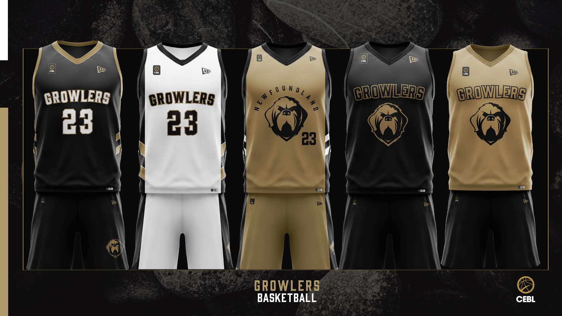
Team Name
(8/10) – Growlers is an excellent, with a potential triple-meaning for the area
even if the identity of the Newfoundland Growlers sticks to the most marketable
and family-friendly of the three. A growler can be jug with a small handle off
of the neck that is used to hold beer. A growler can also be a piano-sized
iceberg, the kind that is often seen floating in the harbours of Newfoundland.
Dogs can also growl as well, as a threat, of course. Newfoundlands are a breed of dog, as
well as a province in Canada, and are a large working dog.
Logo (9/10)
– The Newfoundland is very very well represented. It reads well as a big
intimidating dog, while leaving enough room to be stoic instead of terrifying.
The dog is specifically based off of Sable Chief, a Newfoundland dog adopted by
the Royal Newfoundland Regiment as their mascot during the First World War. The
team’s font is part of the Evanston Alehouse family, which is an incredibly
subtle nod to the beer-based Growler if that was indeed intentional and
otherwise works well as a vintage-style font for the black and gold of the team
colours.
Colours
(8/10) – Gold, black, and white. The gold, or tan, is taken from the locally
iconic photo of Sable Chief which helped inspire the logo. Gold and black are
also excellent colours, as evidenced by recent Toronto Raptors colour-schemes.
Jersey
(7/10) – The Newfoundland Growlers, right out of the gate, have five jerseys.
FIVE! I enjoy them all, though I wonder if at least two could have been
introduced next season so as not to pull attention away from the initial
designs. The side panel features two chevrons in either gold or white depending
on the jersey. The designs also do not feature any secondary logos. Luckily the
strength of the colours, Newfy logo, and font are all the team needs.
X-Factor (4/10)
– This is where we reveal that the strength of the Growlers branding comes from
it being a pre-existing design for a minor-league hockey team. Though this
doesn’t affect the strength of the design, if you noticed the previous scores,
it can’t help but effect the X-Factor. I suspect they’re following the idea of
European football clubs establishing multi-sports organizations under the same
recognizable branding, but partnering with the Toronto Maple Leafs
CHL-affiliate doesn’t have the same ring as a Real Madrid. It can make
Newfoundland and Labrador locals see the Growlers of the CEBL as minor league
as well. Even if the Growler is a very good boy.
SARTORIAL
SCORE - 36/50
How would I
improve the Newfoundland Growlers sartorial score? The CEBL Newfoundland
Growlers obviously have a strong base, so let’s simplify the jersey set by
cutting out two of the selections for the time being (my choice would be the two right most jerseys which look like practice uniforms any way). Establish a secondary
logo as well to give the team branding some ownership within the basketball club side. Dog’s
paw with a basketball as the center pad, or a iceberg basketball logo to play
into the other meaning of the team’s name. Ultimately keep it simple, but give Growlers Basketball something of their own to identify with.
FOURTH
PLACE
Guelph
Nighthawks

Team Name
(8/10) – The Guelph Nighthawks was a name chosen, according to the team,
because of the Nighthawk’s superior intelligence and strategy as a nocturnal
predator in the conservation lands in the area around Guelph. Sure guys! What I
enjoy about name is not only is it a new spin on the Hawk/Eagle/Falcon team
name, which allows for their own animal logo, but it also immediately brings to
mind the painting by Edward Hopper. Which I love. And this is a biased ranking,
at the end of the day, so bonus points. Connecting to Edward Hopper painting
and “night life” in general also connects to Guelph as a University town in my
mind. Shout out to CFRU.
Logo (5/10)
- The Nighthawk is a blue and black hawk with a grey break, angled to the
right. Though the head is well-rendered it is proportionally larger then the
wing that juts out left bellow it, creating a very horizontal logo. Inside the
wing is hidden ‘G’. The logo font looks like it is an LFT Iro Sans, used for
readability in low visibility, and identifiable by the K. However the G is from
a different font family, likely because they wanted a more pronounced serif. It
all works well for the identity, for the sharpness in the N, W, A, and K
especially.
Colours
(7/10) – The blue, black, and silvery grey work well for the night theme of the
main identity and (what’s this?) the secondary Royal identity as well. Even if
two of the four expansion squads since the ‘Original Six’ of the CEBL have gone
with blue as their main colour, the Nighthawk’s classic shade of blue makes
them the CEBL’s “blue team” in my mind.
Jersey (8/10)
– I like something about all three jerseys that the Nighthawks wear. Their dark
jersey is blue with a black and silver “horizon fade” effect for the side
panel. This is likely my favourite side panel in the league, by the way. The
light jersey is white with a blue and white “horizon fade” on the side panel.
The secondary logo on both shorts is a white crescent moon in a black circle.
Simple and smart. Adding to these instant classic regular looks, is a smart and
highly adaptable third jersey. The team name is ”Royal City” taking from
Guelph’s nickname because, to over simplify, Guelph takes it’s name from the
family name of Britain’s King at the time of establishment. The Royal City
script has a lot of personality, and the secondary logo in connection to it, a
crown atop a basketball net, is just a cool icon outside of any CEBL connection
(and is a stronger icon then the team’s logo, which is wild for a third
jersey’s secondary logo).
X-Factor
(10/10) – I would have docked points if both the Nighthawks identity and the
Royal City identities weren’t both so simple and effective, but Guelph did
something that no other team in the league has done up until this point and
that’s use the third jersey to create something new, fun, and different that
ties to the city while keeping it within the brand. The team is also leaning
into home game branding that puts the logo in mainly dark grey colouring with
neon blue in the eye and outline of the logo, giving the team a “Nights”
atheistic to play with in the future. Swoop, the team’s mascot, makes me smile
every time I see it’s beak in such a goofy grin so an A+ choice for that.
SARTORIAL
SCORE - 38/50
How would I
improve the Guelph Nighthawks sartorial score? The logo needs to be more
vertical, and less horizontal. It looks flattened on jerseys and is otherwise
always cropped for league-wide or broadcast purposes. They can still have the
hidden ‘G’ but allow it to shape the breast of the bird instead of looking like
mini-wings with a giant head. You could even drop that 'G' wing all together! Oddly the main logo is big thing holding back the
Nighthawks from the top of the rankings. Their main jersey set feels classic,
their ‘Royal City’ alternate is fantastic, and the visual potential of the
“Guelph Nights” aesthetic gives them potential to have Miami Heat “Vice”-esque
alternate jerseys in the future. I’m most excited in seeing what the Nighthawks
team comes up with next, they have the highest sartorial ceiling in the CEBL.
THIRD
PLACE
Hamilton
Honey Badgers

Team Name
(6/10) – The Hamilton Honey Badgers, the second-ever team name introduced to
the CEBL fans (and first new one after the River Lions) has a name in the Honey Badgers that does not have any
direct connection to the city. Hard-worker, fierce, scrappy, like blue collar steel workers in the area is one thing, sure. Like the Tiger Cats of the CFL, the team
management wanted a tough animal so they chose “the world’s most fearless
animal”, while also being highly aware of the honey badger’s popularity as a
meme. It was the second thing mentioned in the introductory press conference. It’s a bold choice, I respect that they didn’t try to hide it. The name has alliteration too!
Logo
(10/10) – The black and white honey badger in all it’s fierce glory with a
yellow cap of fur on the top if excellent. The logo is almost mirror imaged
except for fur details on the left half of the face. It’s excellent! The logo
font seems to be another custom combination, from my searching at least,
putting together Vintage Whiskey Regular with Winston to create as bold but
readable serif font. With all the implied teeth and claws from the logo and
team name, they couldn’t have possibly gone san-serif.
Colours
(8/10) – Black, yellow, and white are a strong choice, matching the colours of
Hamilton’s other sports club the Ti-Cats, and if you’re going to be inspired by
any other team taking pointers from one that has been around since 1869 isn’t a
bad idea!
Jersey
(10/10) – Bringing together a strong logo and classic colours, the Honey
Badgers do something different from every other CEBL team, and do it incredibly
well. Instead of a side panel pattern the Honey Badgers instead of pinstriped
jerseys. The dark jersey is black with white pinstripes, and the light jersey
is yellow with black pinstripes. It’s an excellent look. The secondary logo on
the side of the shorts are three large Wolverine…err, I mean Honey Badger claw
marks. In merch the claw marks are paired with “HB” very effectively.
X-Factor (5/10)
– As I alluded to with a Freudian slip in the prior paragraph, we have to recognize
that the successful identity of the Hamilton Honey Badgers wasn’t created in a vacuum
and of course owes an incredible amount of inspiration from the University of
Michigan Wolverines. Where inspiration
crosses over in plagiarism may affect your own personal Sartorial Score. Oh,
and Hammer the Honey Badger’s mascot looks nothing like the logo he is based
off of… but does look like a panther with bleach-blonde hair. So that’s fun.
SARTORIAL
SCORE – 39/50
How would I
improve the Hamilton Honey Badgers sartorial score? I wouldn’t change the Honey
Badgers look, it’s classic but due to the Honey Badger being a more meme’d
Wolverine the look will inevitably feel more a brand that belongs to the University of Michigan instead of one which is
solely Hamilton’s. Getting past that though, it’s easily top three in the CEBL
and the closest the league has to a “cool” brand.
SECOND
PLACE
Saskatchewan
Rattlers

Team Name
(7/10) – The Saskatchewan Rattlers are based out of Saskatoon, with the Rattler
name based off of the prairie rattlesnake, a local snake species (in Saskatchewan at least, they aren't found anywhere near Saskatoon). Though it
likely is just co-incidental, the name also brings to mind the beer-based
German radler (or rattler), which had spiked in popularity in 2018/2019 when the team was established, and would connect to the wheat/beer side of the teams
aesthetic.
Logo (7/10)
– The full-body face-forward Rattler logo stands out in the league, while also
exemplifying the animal-based cartoon look that the league leans towards. Using
dark green, beige, and white, the face of the snake is full of character, while
the “rattle” on the tail is recognizably in the shape of a wheat sheaf. The
logo font is Empera, which despite the empirical name gives the Rattlers a bold
and iconic font that fits perfectly within the team’s western aesthetic. During the 2021 play-offs the Rattlers also released a t-shirt designed by Saskatchewan designers Howard & Lloyd that could prove to be an effective starting point for a "faux throwback" logo and jersey.
Colours
(10/10) – The dark green, gold, and white leans nicely into the popular colours
of Saskatchewan, the yellow and green of the provincial flag, and Saskatoon,
which are traditionally green and another colour.
Jersey
(8/10) - The dark jersey is green with gold borders on the collar, arms, and on
the outer-thirds of the side panel, while the center of the side panel is a
green diamond pattern akin to snake skin. On the shorts the secondary logo is
the wheat sheaf-like rattle. The light jersey is white, with green highlight
and a gold and white snake skin pattern. The traditional CEBL third jersey works quite well, leaving enough space for "Saskatchewan", putting the shoulders in green, the body in a prismatic white and the number in gold.
.jpg)
X-Factor (8/10)
– Regional bias? Having grown up in Saskatchewan this thought exercise isn’t
for me. If I have to admit where my CEBL allegiances lie, it is with the
Rattlers. The Rattlers however are the rare team where green and white jerseys feel
right! The mascot’s name is Swisssh, and because he is a snake-man with an
elongated neck, is certainly the most unintentionally terrifying mascot. Points
for comedy! As the inaugural Champions of the CEBL they’ve earned the right to call
their secondary colour gold instead of beige, just FYI.
SARTORIAL
SCORE – 40/50
How would I
improve the Saskatchewan Rattlers sartorial score? The Rattler logo could lose a bit of its more overtly cartoonish appeal, in an attempt to make the overall brand "cooler". We don't have to go all the way to "Don't Tread On Me" snake territory, but there's a middle ground to be found. I understand, of course, giving the kids a fun cartoon to cheer for.
I stated just that in the introduction. That's however the biggest element keeping this team from the top spot.
FIRST
PLACE
Fraser
Valley Bandits

Team Name
(7/10) – The Fraser Valley Bandits are named for the Fraser Valley region which
is found east of Vancouver and west of the Rocky Mountains in British Columbia,
with the Bandits playing out of Abbotsford the most-populous city in the region.
Bandit as a team name likely comes from the outlaw and frontier history of the
gold rush, while also connecting to the fox logo.
Logo (8/10)
– The fox logo is very well designed, creating an orange fox with a bandit’s
mask. The head is turned to the right to give the logo dimension and the
nearest ear is drawn to look like a mountain peak. It’s fantastic. It also
looks like Swiper from Dora the Explorer which amuses me. The logo font, like the Niagra River Lions is from the
Pittsbrook family, but is a serif variant (which honestly gives it more
personality then the Lions use of the font). The serifs on the font bring a
visual playfulness that is perfect for the franchise and implies a frontier
feel.
Colours
(8/10) – Orange, dark blue, and cream are an excellent combination that the
team uses well. The warm orange of the identity allows the team to stand out in
a CEBL which, though small, already has a surprising amount of colour overlap.
Jersey
(10/10) – The Bandits dark and light jerseys are potentially my favourite in
the league, in a neck to neck race with the Honey Badgers. The dark jersey is
the dark blue, which works due to the way it holds the logo and ‘Bandits’ name
in cream, but also the use of north pointing chevrons in alternating colours as
the side panel. It’s a excellent side panel which adds the perfect amount of
personality to the design. The light colour is in orange, and is a great pop of
colour while also being given a slightly different side panel as the dark blue
is added. The secondary logo on the shorts is a triangular mountain which is
simple yet effective reference to the fox ear design. No notes, just praise!
X-Factor (8/10)
– The Bandits also have a tertiary logo, an inter-locked F and V which looks to
be mainly used on merch. Their mascots name is Berry the Bandit, a nod to
Abbotsford being the “Raspberry Capital of the World” which is cute. Berry
still very much looks like Swiper. Bonus point to the Bandits for teaming up
with Kwantlen First Nation to redesign their logo for a partnership with the
Indigenous Sport, Physical Activity & Recreation Council. It’s an excellent community
initiative, and an A+ adaptation.
SARTORIAL
SCORE – 41/50
How would I
improve the Fraser Valley Bandits sartorial score? Put that Indigenous
Basketball Collective logo on a game alternate and put sales of merch and at
least a portion of game revenue towards supporting that collective. It’s both a
sartorial win, and a step towards truth and reconciliation. I don’t have much
else, in terms of improvement, except for… keep up the good work!
With that said, we can bring this thought exercise to a close. I hope you've found a new favourite CEBL team even if you came into this completely unfamiliar with the league! Of course you don't have to choose the highest scoring team, sartorially, of 2022... but I am safe in the knowledge that this completely scientific (and not at all arbitrary) method was a success!
To give a peak behind the curtain, the Saskatchewan Rattlers are indeed my favourite CEBL team thanks to "home town bias", but before the scoring system was fully tallied I had placed the Hamilton Honey Badgers in the first place rankings. However the numbers don't lie, so the Badgers and Bandits switched spots when it all came together.
What will this Ranking look like in 2023? I look forward to finding out, especially as the CEBL expands and potentially brings teams to Calgary, Winnipeg, Quebec City, or elsewhere! The CEBL have shown that they are friendly towards the Canadian mid-market with franchises in Guelph and Abbotsford, so major hubs like the previously mentioned could potentially be joined by the likes of Red Deer, Swift Current, Sudbury, or Saint John. Local fans, if you want a pro team in your city, let the CEBL know! Naturally I've already started thinking about the identities of Calgary and Winnipeg, which connect to the colours and themes of the areas. Best to keep it to myself, and save it for a future Sartorial Ranking however!
Russel Harder has hosted and produced Trivia Club for ten years across Toronto, while also producing events across Canada! Support Trivia Club on Patreon! Trivia Club can be found on on YouTube, as well as well as an audio-only version on SoundCloud, Google Podcasts, and iTunes!


0 comments